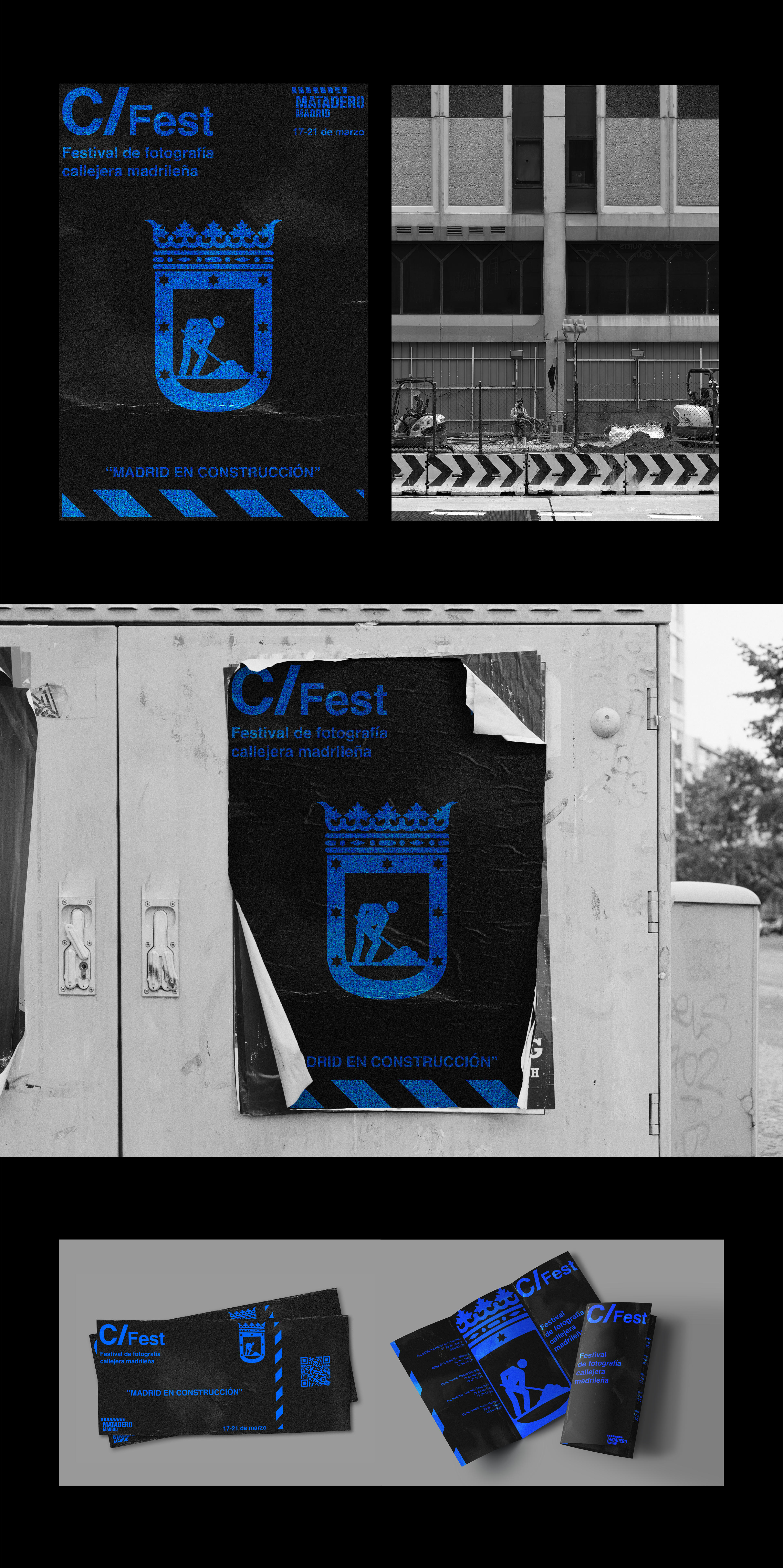
La identidad gráfica del festival de fotografía callejera C / Fest, utiliza el concepto de edificación y construcción como símbolo de la ciudad ligado a sus calles, representando a Madrid como una ciudad en continua evolución y crecimiento, manteniendo una estética contrastada entre la belleza arquitectónica de la ciudad y el "caos" de la construcción.
The graphic identity of the street photography festival C / Fest, uses the concept of building and construction as a symbol of the city linked to its streets, representing Madrid as a city in continuous evolution and growth, maintaining an aesthetic contrasted between the architectural beauty of the city and the "chaos" of construction.
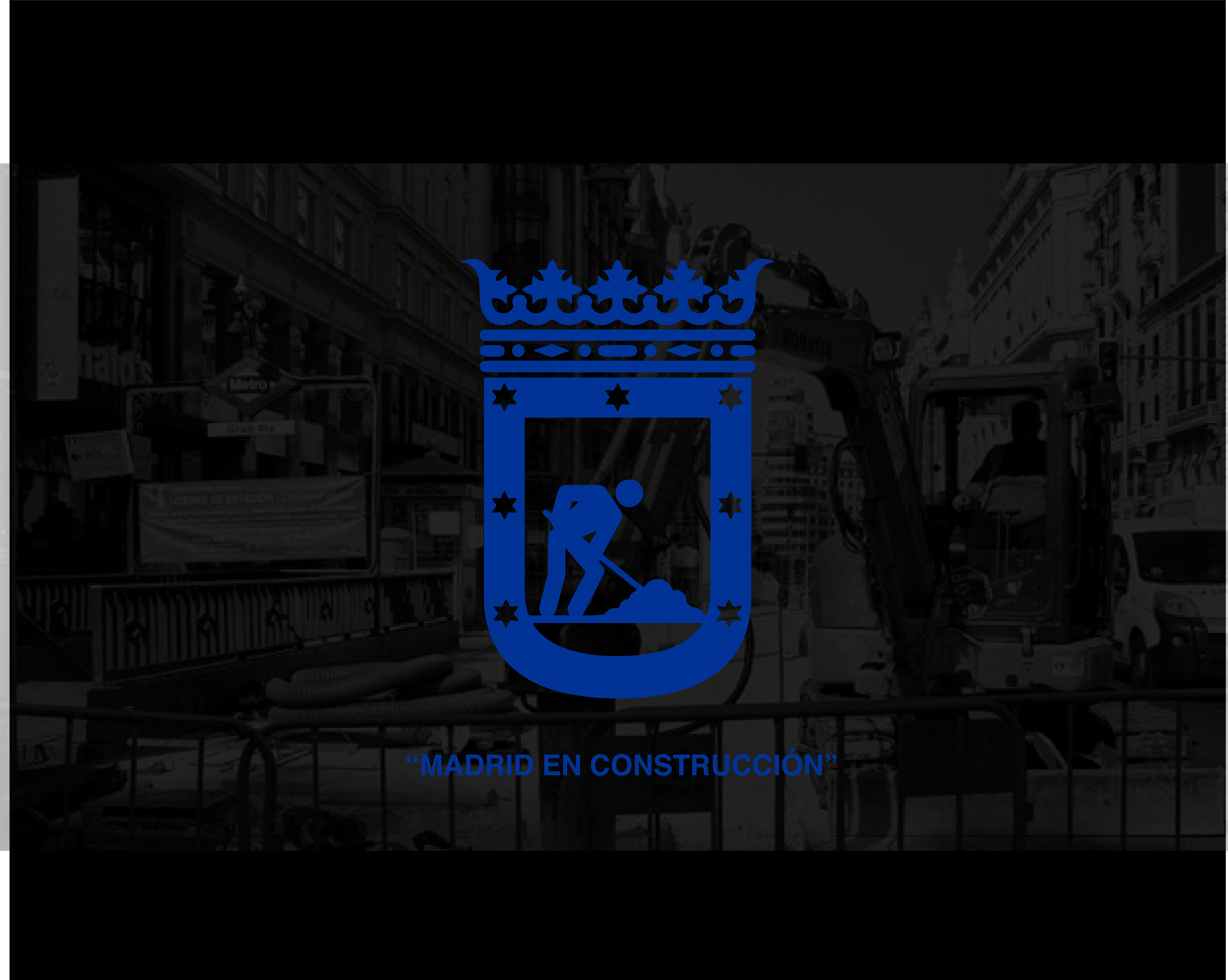

Toda la línea gráfica está inspirada en la señalización de la construcción, desde la tipografía hasta los pictogramas y elementos gráficos, utilizando el color corporativo de la identidad del Ayuntamiento de Madrid (azul), y el rediseño del escudo de la ciudad convertido en rótulo de obra.
The entire graphic line is inspired by the signage of the construction, from the typography to the pictograms and graphic elements, using the corporate color of the Madrid City Council identity (blue), and the redesign of the city's logo turned into a sign of construction.